> ## Documentation Index
> Fetch the complete documentation index at: https://docs.caplena.com/llms.txt
> Use this file to discover all available pages before exploring further.
# Driver Analysis
> Understand which topics have the greatest influence on KPIs like NPS, satisfaction, or star ratings.
Key driver analysis is a powerful way of measuring the **relative impact of topics on a KPI**. It helps you understand how much a topic influences performance metrics such as:
* Likelihood to recommend (e.g., NPS)
* Overall satisfaction
* Star ratings
* Other custom KPIs
## What's included in the driver analysis
The driver analysis includes four key elements:
| Chart section | Details |
| :------------------------------ | :------------------------------------------------------------------------------------------------------- |
| **Impact per mention** | Measures impact on the performance metric on an individual basis, based on multiple regression analysis. |
| **Net impact** | Shows overall impact by combining driver strength and frequency of mentions. |
| **Suggestions for improvement** | AI-powered recommendations on how to improve key topics. |
| **Driver Impact vs. Mentions** | Scatter plot showing driver strength vs. frequency for easy prioritization. |
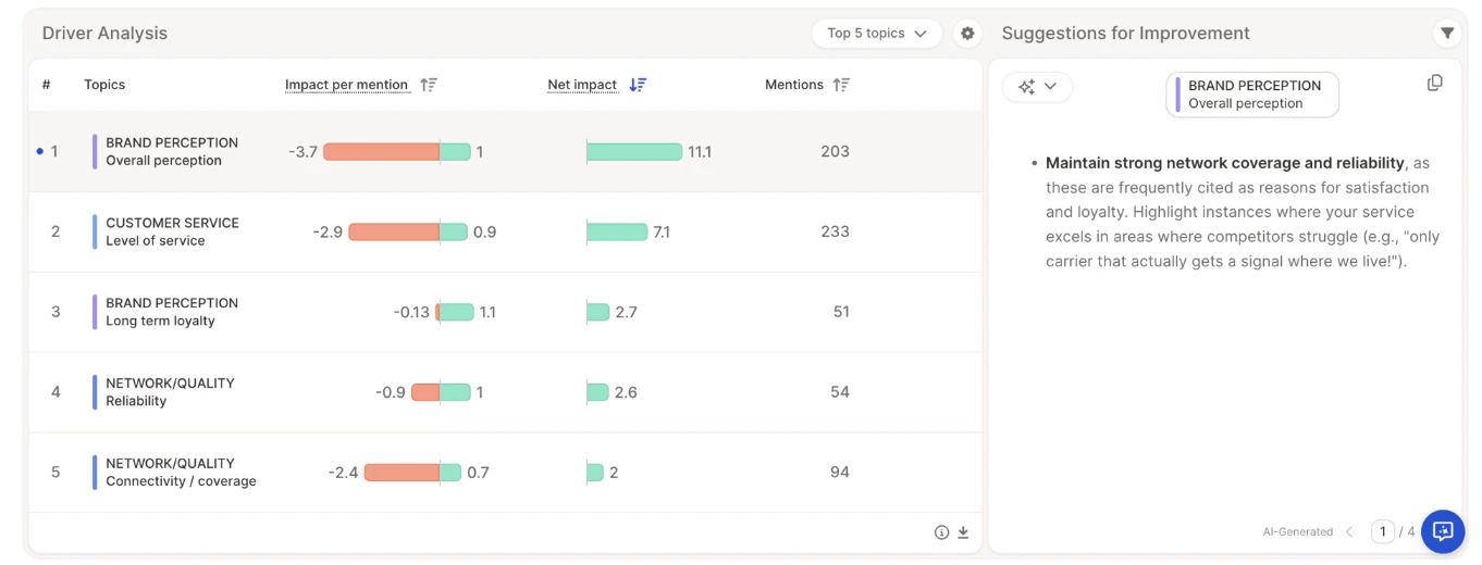
## Impact per mention
Topic sentiment plays a key role in driver analysis, allowing Caplena to determine the impact of a topic based on positive and negative experiences.
* The **color coding** of the bars reflects sentiment-based impact.
* The **numbers next to the bars** show regression coefficients.
* The higher (or lower) the number, the stronger the impact on the likelihood to recommend.
**NETWORK QUALITY / Reliability** — the red and green bars are nearly equal in length, meaning both positive and negative experiences significantly influence the likelihood to recommend.
Someone mentioning unreliable network quality would likely not recommend the provider.
**CUSTOMER SERVICE / Level of service** — a negative perception has a very strong negative impact, while a positive perception does not significantly boost recommendation.
This indicates a **"hygiene driver"** (Kano model): customers expect good service and react strongly when it falls short.
## Net impact
The impact per mention measures individual cases, but to understand the overall effect on a KPI across the full sample, frequency must also be considered. Net impact combines **driver strength** with **mention frequency** to show how much a topic moves the needle overall.
NPS is not a simple linear metric — it's based on a non-linear step function. For example, a score increase from 2 to 6 still counts as a detractor, leaving overall NPS unchanged. To address the limitations introduced by this rigid structure, Caplena uses advanced probabilistic modeling to estimate the true net impact more accurately.
### How net impact is calculated
Here's the step-by-step process behind the number:
1. **Calculate the baseline score** — Caplena calculates your actual overall score using all responses as they are.
2. **Determine the isolated pull of the topic** — Using statistical modeling, Caplena finds an impact coefficient for the topic: how many points a positive, negative, or neutral mention tends to pull a single person's rating up or down.
3. **Run a simulation for positive mentions** — To measure how much positive mentions moved the needle:
* The positive pull of the topic is mathematically removed from everyone's rating and the overall score is recalculated.
* The difference between this simulated score and the baseline is then scaled down by the actual percentage of respondents who mentioned the topic positively.
Simulating across everyone and then scaling down is a technique used to prevent volatile results that occur when respondents are right on the edge of an NPS boundary.
4. **Repeat for negative and neutral mentions** — The same simulation is run separately for negative and neutral mentions.
5. **Combine for the final net impact** — The simulated impacts of positive, negative, and neutral mentions are added together. The result is the **Net Impact** — the total points this topic contributed to your overall score.
###
Taking **BRAND PERCEPTION / Overall perception**:
* This topic has the highest net impact based on the combination of driver strength and frequency.
* Although it has a significant negative impact when raised individually, it is most often associated with positive experiences — resulting in a strong overall net contribution.
* With **n = 203** mentions, driver strength and the balance of positive vs. negative mentions ultimately determine the net impact.
> **BRAND PERCEPTION / Overall perception = +11.1 points**
The driver chart currently supports NPS and 5-Star Rating as dependent variables. Additional performance metrics will be added soon.
## Suggestions for improvement
For each topic, Caplena provides AI-generated suggestions based on open text analysis and driver calculation results.
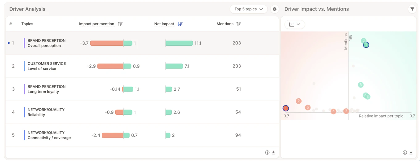
## Driver Impact vs. Mentions
Clicking the icon in the top-left of the suggestion box toggles a scatter plot that visualizes:
* **Horizontal axis** — Impact (right = positive, left = negative)
* **Vertical axis** — Mention frequency
This helps you quickly identify which topics to prioritize.
## Video walkthrough
 | Chart section | Details |
| :------------------------------ | :------------------------------------------------------------------------------------------------------- |
| **Impact per mention** | Measures impact on the performance metric on an individual basis, based on multiple regression analysis. |
| **Net impact** | Shows overall impact by combining driver strength and frequency of mentions. |
| **Suggestions for improvement** | AI-powered recommendations on how to improve key topics. |
| **Driver Impact vs. Mentions** | Scatter plot showing driver strength vs. frequency for easy prioritization. |
## Impact per mention
Topic sentiment plays a key role in driver analysis, allowing Caplena to determine the impact of a topic based on positive and negative experiences.
* The **color coding** of the bars reflects sentiment-based impact.
* The **numbers next to the bars** show regression coefficients.
* The higher (or lower) the number, the stronger the impact on the likelihood to recommend.
**NETWORK QUALITY / Reliability** — the red and green bars are nearly equal in length, meaning both positive and negative experiences significantly influence the likelihood to recommend.
| Chart section | Details |
| :------------------------------ | :------------------------------------------------------------------------------------------------------- |
| **Impact per mention** | Measures impact on the performance metric on an individual basis, based on multiple regression analysis. |
| **Net impact** | Shows overall impact by combining driver strength and frequency of mentions. |
| **Suggestions for improvement** | AI-powered recommendations on how to improve key topics. |
| **Driver Impact vs. Mentions** | Scatter plot showing driver strength vs. frequency for easy prioritization. |
## Impact per mention
Topic sentiment plays a key role in driver analysis, allowing Caplena to determine the impact of a topic based on positive and negative experiences.
* The **color coding** of the bars reflects sentiment-based impact.
* The **numbers next to the bars** show regression coefficients.
* The higher (or lower) the number, the stronger the impact on the likelihood to recommend.
**NETWORK QUALITY / Reliability** — the red and green bars are nearly equal in length, meaning both positive and negative experiences significantly influence the likelihood to recommend.
 Clicking the icon in the top-left of the suggestion box toggles a scatter plot that visualizes:
* **Horizontal axis** — Impact (right = positive, left = negative)
* **Vertical axis** — Mention frequency
This helps you quickly identify which topics to prioritize.
## Video walkthrough
Clicking the icon in the top-left of the suggestion box toggles a scatter plot that visualizes:
* **Horizontal axis** — Impact (right = positive, left = negative)
* **Vertical axis** — Mention frequency
This helps you quickly identify which topics to prioritize.
## Video walkthrough