> ## Documentation Index
> Fetch the complete documentation index at: https://docs.caplena.com/llms.txt
> Use this file to discover all available pages before exploring further.
# Insight Elements - General Overview & Settings
> Overview of Insight Elements in Caplena: Types, Use Cases, and Customization Options
**Insight elements** are modular blocks you can add to any report in Caplena to highlight key findings, add context, or visualize data. They help turn your analysis into a narrative that's easy to understand and share with stakeholders.
Caplena offers different types of Insight Elements, grouped by purpose:
* **Scores & Ratings** – For metrics like NPS or star ratings
* **Drivers & Trends** – To show what impacts scores and how topics evolve
* **Topic Visualizations** – To compare frequency or sentiment across topics
* **Text-Based Elements** – For summaries, notes, or verbatim quotes
* **Distributions & Overviews** – To display numerical or categorical patterns
**Tip:**
Combine elements from different groups to create a well-rounded, insight-driven report.
## How to Add an Insight Element
* Go to the Report Master.
* Click **"+ Add new insight element here"**.
* Choose your desired element.
The single-score variants of **NPS Score**, **Generic Score**, and **Star Rating** are also available on projects **without a Text to analyze column**. When adding one of these elements, the *Text to analyze* selector is optional — leave it blank and the score gauge is shown on its own, so purely quantitative datasets can still use them.
Once you've added your Insight Elements, you can tailor both how they look and what they include.
## View Options (Insight Elements Display)
**View options** control **how** the data is displayed. View options do **not** change the base of respondents.
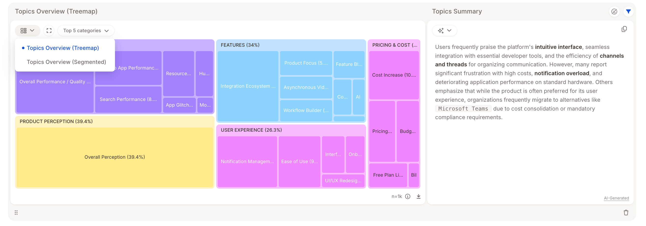 Examples of view types:
* Bar chart vs. treemap
* Segmented bar vs. breakdown layout
* Show "Top 10 Topics" or a specific category
> **Example**:
>
> Switching from "Topics Overview (Segmented)" to "Topics Overview (Treemap)" presents the same data in a different layout, no change to the respondent base.
## Displayed timeframe
For elements that pair a single-value summary (such as a gauge, score, or headline number) with a chart over time, you can choose **which time period the summary value reflects**. The setting only affects the summary, not the time-series chart next to it.
Examples of view types:
* Bar chart vs. treemap
* Segmented bar vs. breakdown layout
* Show "Top 10 Topics" or a specific category
> **Example**:
>
> Switching from "Topics Overview (Segmented)" to "Topics Overview (Treemap)" presents the same data in a different layout, no change to the respondent base.
## Displayed timeframe
For elements that pair a single-value summary (such as a gauge, score, or headline number) with a chart over time, you can choose **which time period the summary value reflects**. The setting only affects the summary, not the time-series chart next to it.
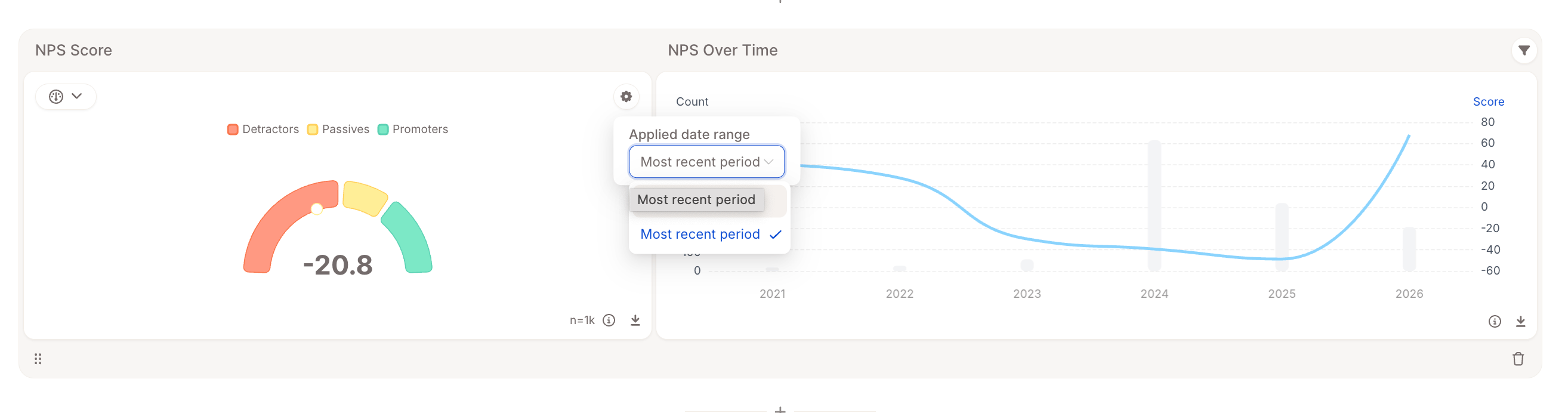 You can choose between:
* **Entire period** – the summary is computed across all data in the report's date range.
* **Most recent period** – the summary is computed only from the most recent time bucket (week, month, quarter, etc.) in the report's date range.
The selected period is reflected in the element's AI-generated description (for example, "*…computed over only the most recent time period*" vs. "*…computed over the entire period*"), so it's clear which slice of data the headline number represents.
**Where it's available**
The **Displayed timeframe** option is supported on the time-aware summary widgets of:
* **Overall Sentiment** – the net-sentiment gauge and segmented bar chart
* **Generic Score** and **Multi Score** – the score gauge, pie, and segmented bar chart
* **Row Count over time** – the headline row-count number
* **Topic Trends**
Use *Most recent period* when you want the headline to track the latest state of your data (e.g., "this month's net sentiment"), and *Entire period* when you want a stable benchmark across the full report range.
## Individual Filters
Each Insight Element lets you **refine the data it shows,** without affecting other elements in the report. These filters **do** change the base of respondents shown in that specific element.
You can choose between:
* **Entire period** – the summary is computed across all data in the report's date range.
* **Most recent period** – the summary is computed only from the most recent time bucket (week, month, quarter, etc.) in the report's date range.
The selected period is reflected in the element's AI-generated description (for example, "*…computed over only the most recent time period*" vs. "*…computed over the entire period*"), so it's clear which slice of data the headline number represents.
**Where it's available**
The **Displayed timeframe** option is supported on the time-aware summary widgets of:
* **Overall Sentiment** – the net-sentiment gauge and segmented bar chart
* **Generic Score** and **Multi Score** – the score gauge, pie, and segmented bar chart
* **Row Count over time** – the headline row-count number
* **Topic Trends**
Use *Most recent period* when you want the headline to track the latest state of your data (e.g., "this month's net sentiment"), and *Entire period* when you want a stable benchmark across the full report range.
## Individual Filters
Each Insight Element lets you **refine the data it shows,** without affecting other elements in the report. These filters **do** change the base of respondents shown in that specific element.
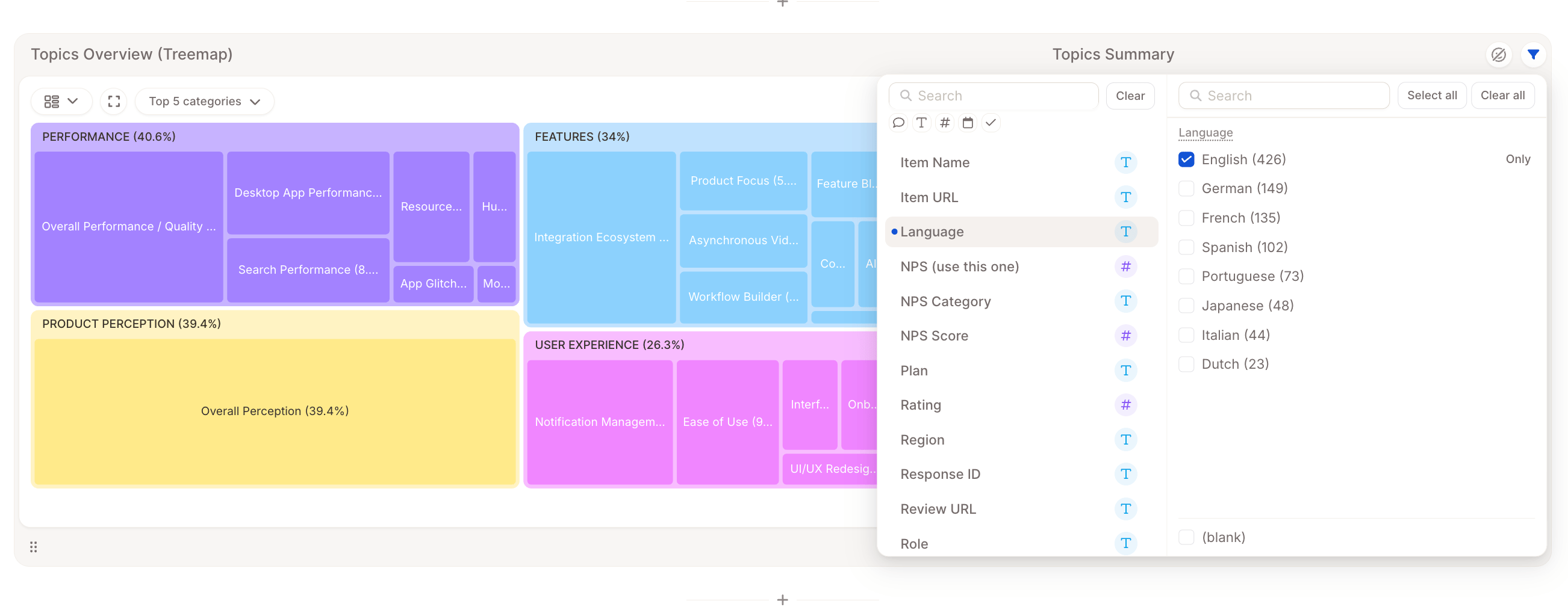 You can:
* Include or exclude specific **topics** or **categories**
* Skip empty rows
> **Example**:
>
> Show only comments mentioning "flight delays" in a Topics Overview chart.
## Explore Responses Behind the Data
You can **click on any Insight Element** to drill down and see the actual responses that power it.
If **Sentiment Analysis** is enabled, you'll also be able to **filter by sentiment** to explore positive, neutral, or negative feedback in context.
You can:
* Include or exclude specific **topics** or **categories**
* Skip empty rows
> **Example**:
>
> Show only comments mentioning "flight delays" in a Topics Overview chart.
## Explore Responses Behind the Data
You can **click on any Insight Element** to drill down and see the actual responses that power it.
If **Sentiment Analysis** is enabled, you'll also be able to **filter by sentiment** to explore positive, neutral, or negative feedback in context.