> ## Documentation Index
> Fetch the complete documentation index at: https://docs.caplena.com/llms.txt
> Use this file to discover all available pages before exploring further.
# Topic Breakdown / Heatmap
> Compare topics across segments, brands, or regions to identify trends and significant differences.
The **Topic Breakdown / Heatmap** is a powerful visualization tool that helps you compare **brands, segments, or regions** across key topics. With **color intensity** and **significance indicators**, it makes spotting trends in large datasets simple and effective.
## Key Components
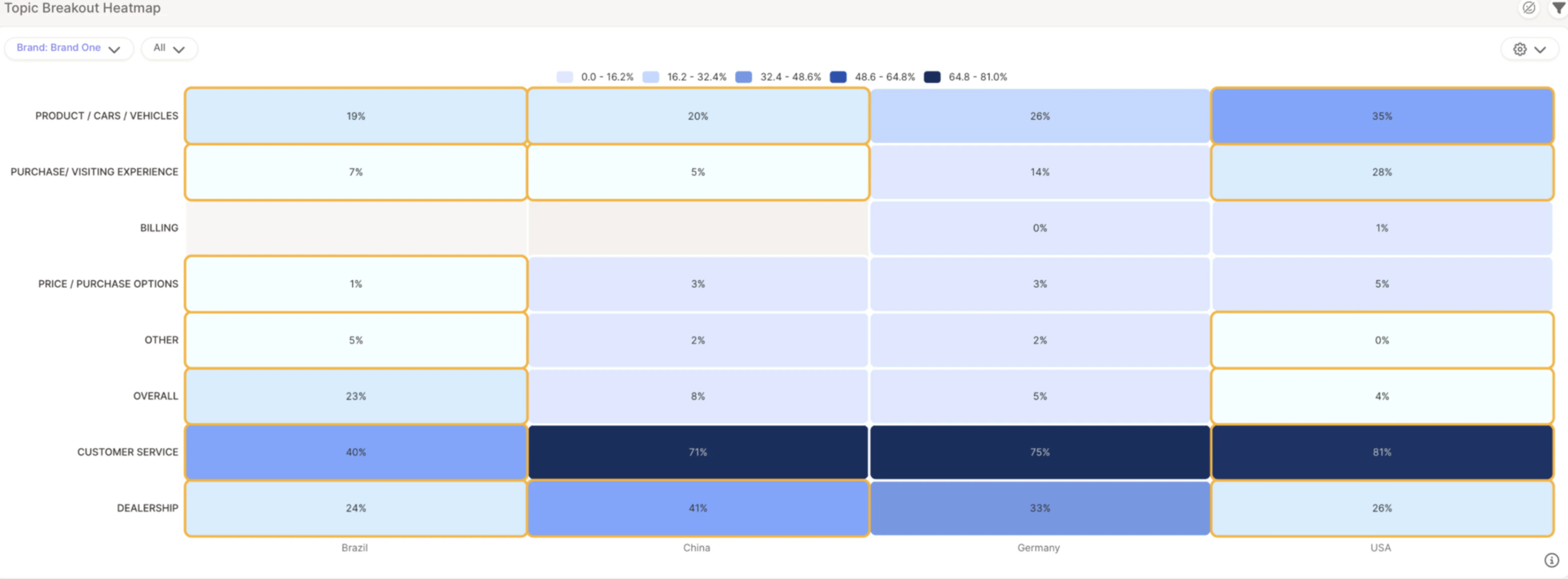
1. **Rows** — Represent topics (e.g., *Customer Service*, *Pricing*)
2. **Columns** — Represent segments, brands, or regions (e.g., *Brand One*, *Germany*, *USA*)
3. **Cell values** — Show the **% of responses** that mention a specific topic
4. **Color intensity** — Light blue = lower mention %, dark blue = higher mention %
## Statistically Significant Differences
One of the most valuable features of the Heatmap is its ability to highlight **statistically significant differences** using **yellow boxes** — these flag where a topic is mentioned significantly more or less in one segment versus others.
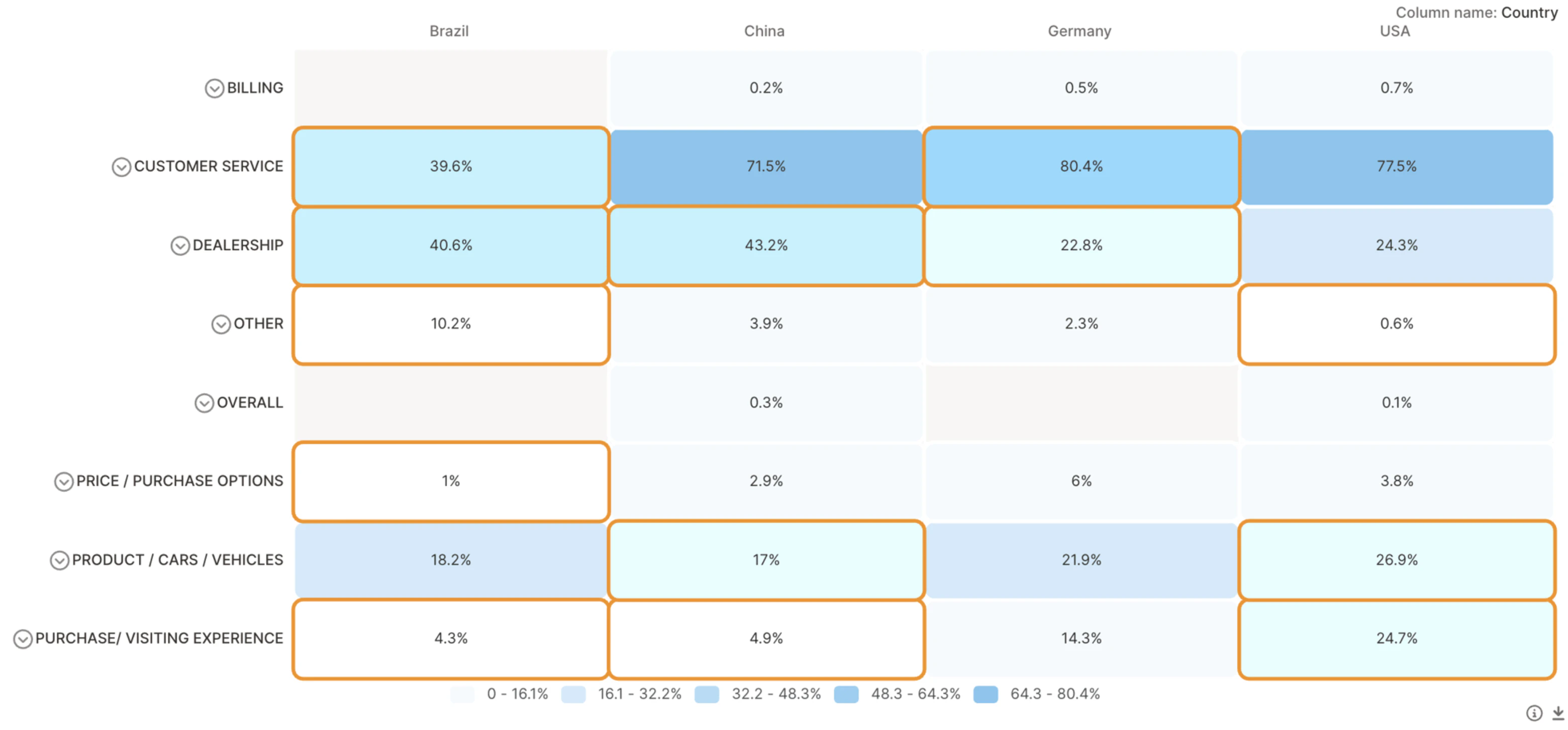
For example, if *Customer Service* is mentioned by 39.6% of respondents in Brazil but 80.4% in the USA, that difference is flagged as significant because it's unlikely to be due to chance.
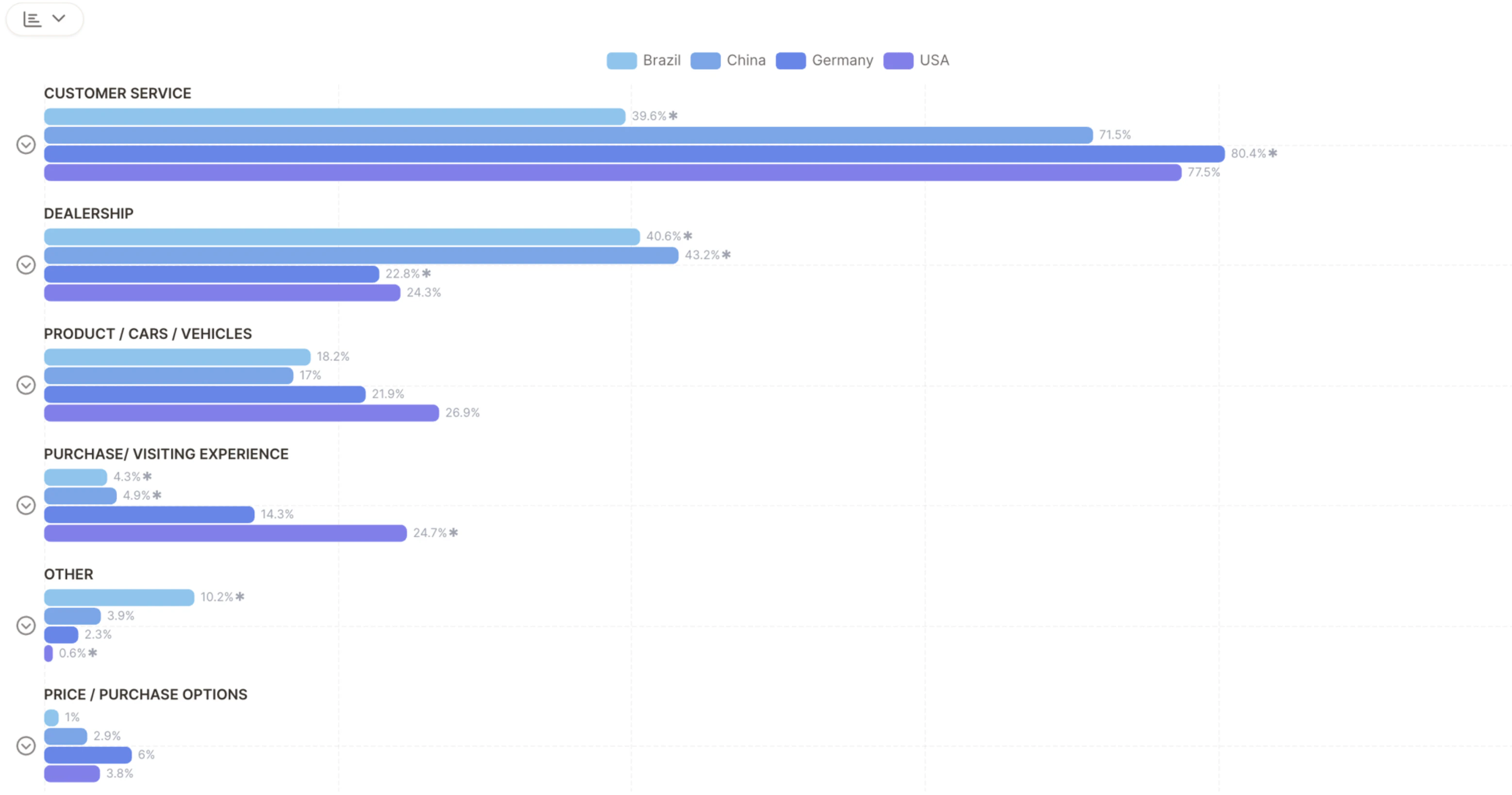
For clearer side-by-side comparison, you can **switch to a bar chart view** — each bar shows topic frequency per segment, and a **★ star** indicates a statistically significant difference (equivalent to the yellow boxes in the heatmap).
## Add Sentiment to Your Heatmap
Toggle **sentiment filters** to explore positive, neutral, or negative sentiment per topic and segment.
* **Spot strengths** — Topics with high positive sentiment
* **Identify weaknesses** — Topics with high negative sentiment
* **Compare across regions** — See how brand perception shifts by location
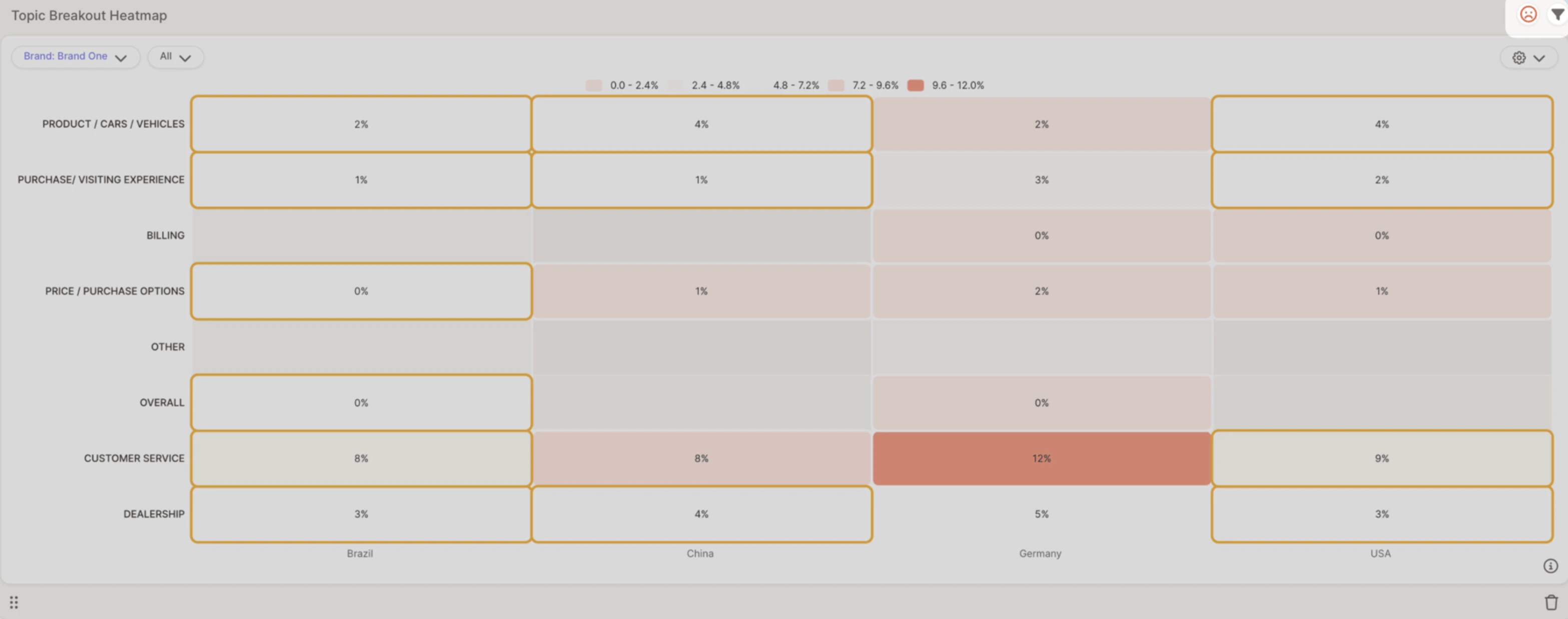
**Example:** *Customer Service* in **Germany** is mentioned in 12% of responses, mostly with negative sentiment — suggesting potential service issues in that region.
## Video Walkthrough
 1. **Rows** — Represent topics (e.g., *Customer Service*, *Pricing*)
2. **Columns** — Represent segments, brands, or regions (e.g., *Brand One*, *Germany*, *USA*)
3. **Cell values** — Show the **% of responses** that mention a specific topic
4. **Color intensity** — Light blue = lower mention %, dark blue = higher mention %
## Statistically Significant Differences
One of the most valuable features of the Heatmap is its ability to highlight **statistically significant differences** using **yellow boxes** — these flag where a topic is mentioned significantly more or less in one segment versus others.
1. **Rows** — Represent topics (e.g., *Customer Service*, *Pricing*)
2. **Columns** — Represent segments, brands, or regions (e.g., *Brand One*, *Germany*, *USA*)
3. **Cell values** — Show the **% of responses** that mention a specific topic
4. **Color intensity** — Light blue = lower mention %, dark blue = higher mention %
## Statistically Significant Differences
One of the most valuable features of the Heatmap is its ability to highlight **statistically significant differences** using **yellow boxes** — these flag where a topic is mentioned significantly more or less in one segment versus others.
 For example, if *Customer Service* is mentioned by 39.6% of respondents in Brazil but 80.4% in the USA, that difference is flagged as significant because it's unlikely to be due to chance.
For clearer side-by-side comparison, you can **switch to a bar chart view** — each bar shows topic frequency per segment, and a **★ star** indicates a statistically significant difference (equivalent to the yellow boxes in the heatmap).
For example, if *Customer Service* is mentioned by 39.6% of respondents in Brazil but 80.4% in the USA, that difference is flagged as significant because it's unlikely to be due to chance.
For clearer side-by-side comparison, you can **switch to a bar chart view** — each bar shows topic frequency per segment, and a **★ star** indicates a statistically significant difference (equivalent to the yellow boxes in the heatmap).
 ## Add Sentiment to Your Heatmap
Toggle **sentiment filters** to explore positive, neutral, or negative sentiment per topic and segment.
## Add Sentiment to Your Heatmap
Toggle **sentiment filters** to explore positive, neutral, or negative sentiment per topic and segment.
 * **Spot strengths** — Topics with high positive sentiment
* **Identify weaknesses** — Topics with high negative sentiment
* **Compare across regions** — See how brand perception shifts by location
* **Spot strengths** — Topics with high positive sentiment
* **Identify weaknesses** — Topics with high negative sentiment
* **Compare across regions** — See how brand perception shifts by location