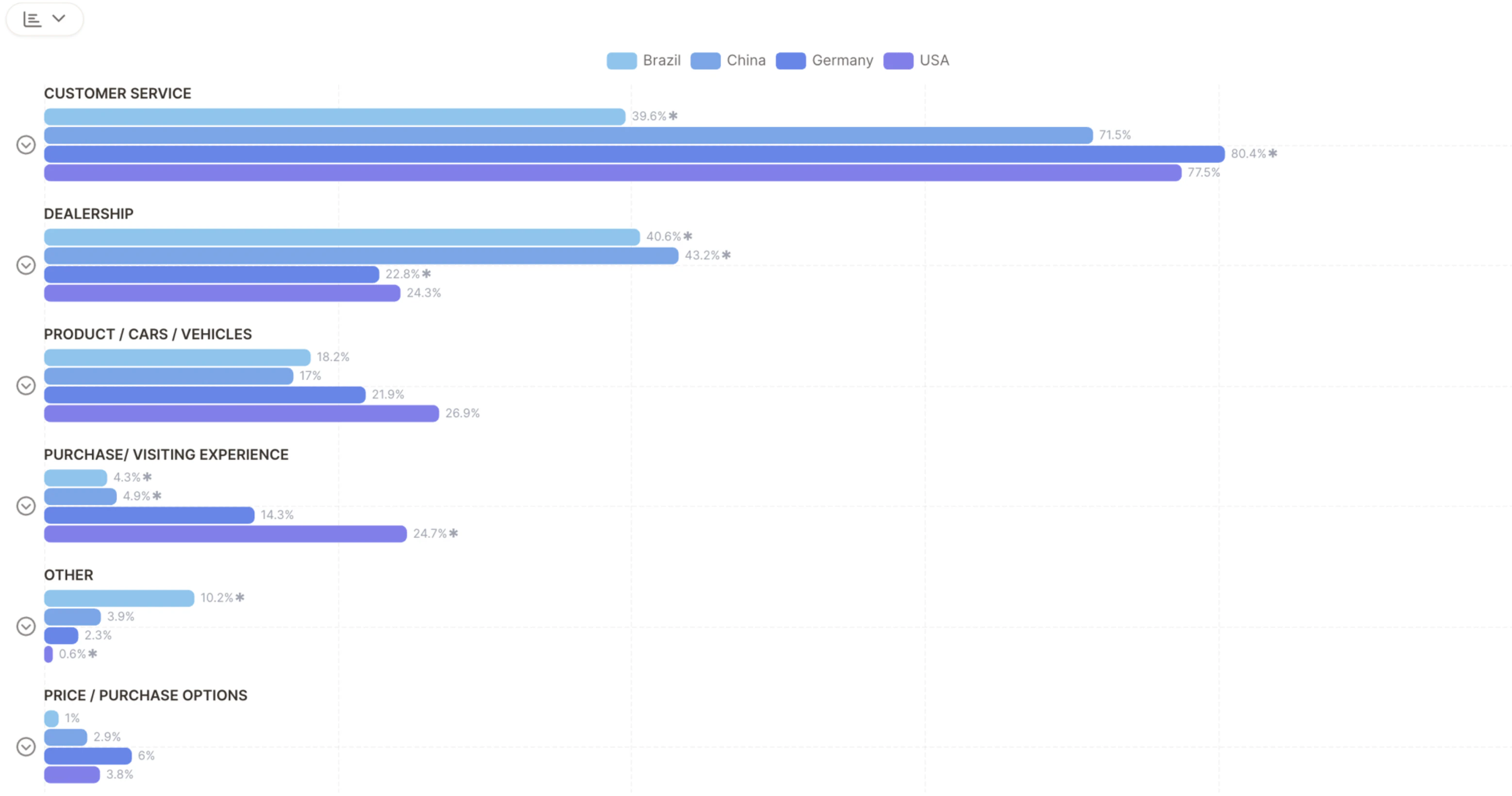
Key Components
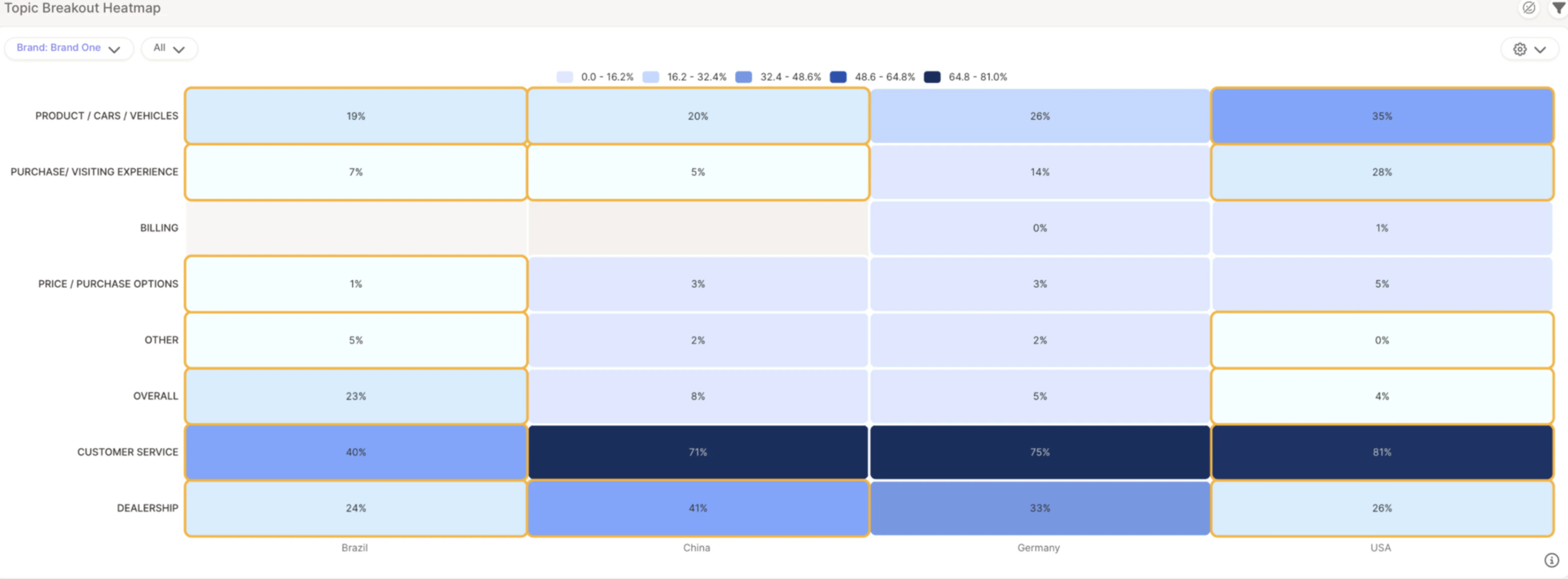
- Rows — Represent topics (e.g., Customer Service, Pricing)
- Columns — Represent segments, brands, or regions (e.g., Brand One, Germany, USA)
- Cell values — Show the % of responses that mention a specific topic
- Color intensity — Light blue = lower mention %, dark blue = higher mention %
Statistically Significant Differences
One of the most valuable features of the Heatmap is its ability to highlight statistically significant differences using yellow boxes — these flag where a topic is mentioned significantly more or less in one segment versus others.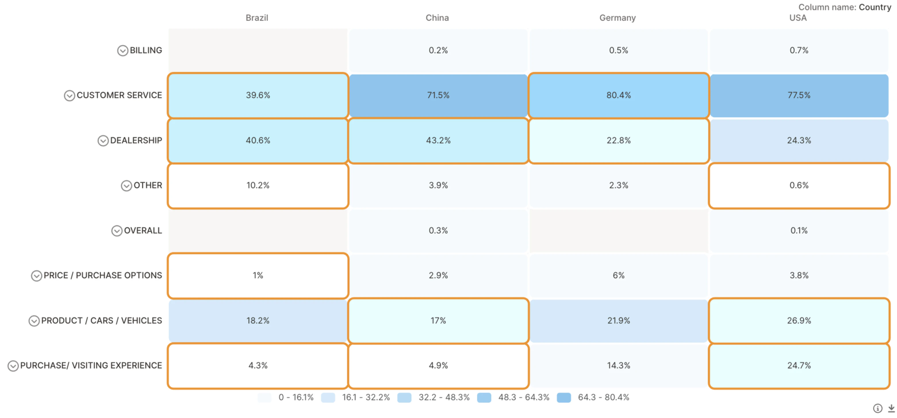
Add Sentiment to Your Heatmap
Toggle sentiment filters to explore positive, neutral, or negative sentiment per topic and segment.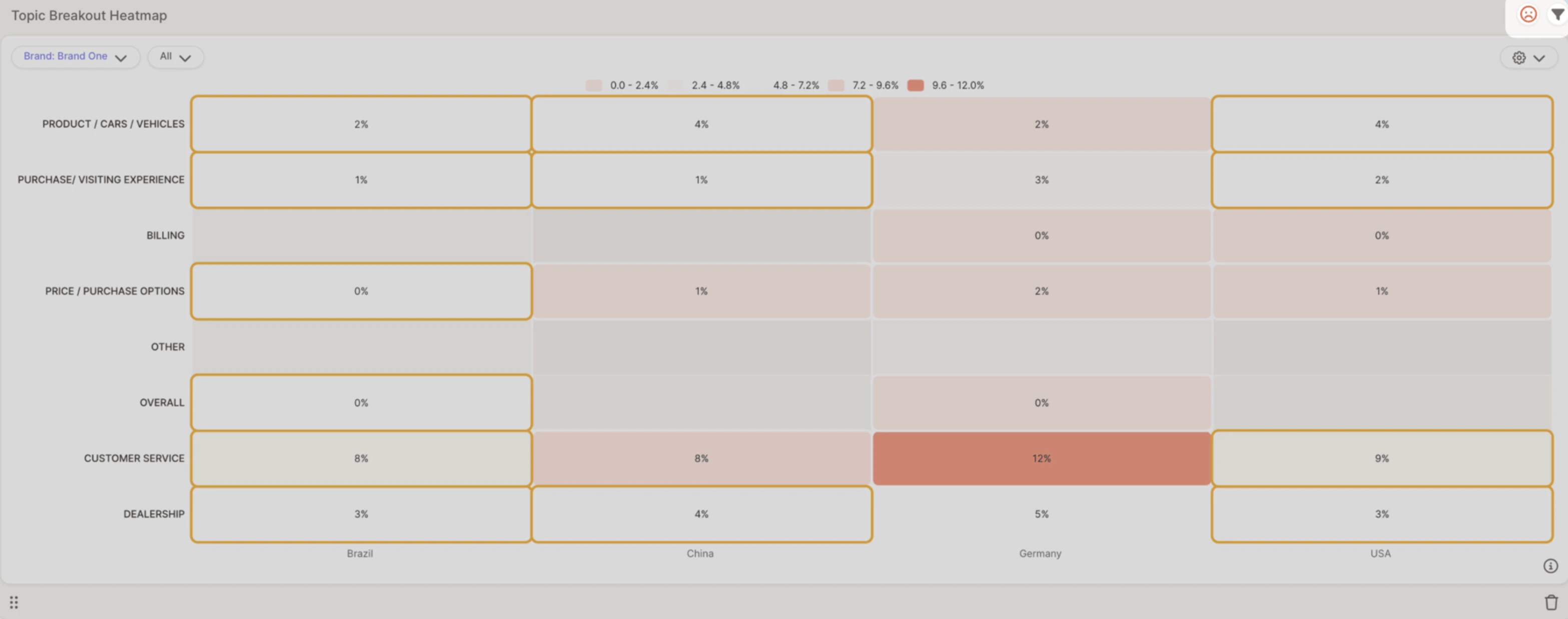
- Spot strengths — Topics with high positive sentiment
- Identify weaknesses — Topics with high negative sentiment
- Compare across regions — See how brand perception shifts by location
Example: Customer Service in Germany is mentioned in 12% of responses, mostly with negative sentiment — suggesting potential service issues in that region.