Caplena reports are designed to make insight-building simple, structured, and powerful. This guide explains everything you need to know to build, structure, and customize reports in Caplena
🔎 In this article:
The Core Concept: How Reports Are Structured
Every report in Caplena has two layers:
-
Report Master – where you build the structure
-
Views – different perspectives on top of that structure
Let’s walk through each one.

Report Master: Where You Build the Report
The Report Master is the blueprint of your report. This is where you build and edit the actual content of your report, what appears, how it’s structured, and how the story flows.
In the Master, you can:
-
Add / remove / rename Sections
-
Add and arrange Insight Elements
-
Reorder anything via drag-and-drop
-
Adjust layout and structure
- Build Segments

Any change you make here automatically updates every View.
This keeps your report consistent, clean, and easy to maintain, no version drift, no duplicates.
Use the Report Master when you want to change the content or structure of the report.
Views: Tailored Perspectives for Your Audience
Views let you create different angles on top of the same structure.
A View is a perspective where you can:
-
Apply or lock local filters
-
Choose specific segments
-
Share a single View without sharing the entire report

Views allow you to tailor insights for different stakeholders, teams, or themes, without modifying the underlying structure.
Common examples:
By region: DACH, North America
-
By segment: New vs. returning customers
-
By feedback type: Detractors, negative sentiment
-
By product/channel: Mobile app, checkout flow
-
By time period: Pre-/post-launch, last 30 days
-
By stakeholder: Leadership summary, Product view
Views do not change the structure. Sections, insights, and layout always remain controlled by the Master.
Use Views when you want to customize what data appears, not how the report is built.
The Report Master is where you build and maintain the content of the report. All structural changes, sections, insights, layout, happen here and automatically apply to every View. Here is how you do it.
Sections: Organize Your Report
Sections help you break down complex data into manageable chunks, making your report easier to read and understand.

How to Add a Section:
-
In Edit Mode, click + Add New Section.
-
Give your section a name (e.g., “NPS Breakdown”, “Sentiment by Product”).
-
Add visualizations, summaries, or custom text.
Benefits:
-
Better Organization: Keep related insights grouped together.
-
Improved Readability: Help readers focus on one topic at a time.
-
Drag-and-Drop Order: Rearranging sections is as simple as dragging them in the side panel.
Insight Elements: Visualize What Matters
Insight Elements are pre-built components that let you analyze and display your data in a powerful, digestible format.

Available Elements:
-
NPS & Ratings: Show Net Promoter Scores, star ratings, and score distributions.
-
Trends & Drivers: Reveal what’s impacting sentiment over time.
-
Sentiment Analysis: Show overall or category-specific sentiment.
-
Topic Insights: Break down feedback into themes or categories.
How to Add an Insight:
-
In Edit Mode, choose an insight type from the left panel.
-
Review its preview and purpose.
-
Click Select Columns to map the correct data fields.
-
The insight will be added to the current section.
Filters & Segments: Focus Your Analysis
Caplena’s Filters and Segments let you dive deeper into your data by zooming in on what’s most relevant, whether that’s a specific brand, region, or time frame.
Filters
Use filters to narrow your data view:
-
By Brand: Compare customer experiences across products.
-
By Country: Identify regional differences.
-
By Rating: Focus on 1–2 star reviews to uncover pain points.

Example:
Filter for 1–2 star reviews from Germany to understand local pain points.
Creating Segments
You can create segments in two ways, using AI or manually.
AI-assisted segment creation
In Edit Master, select the Overall segment and click Edit. You'll see the option to describe the segment you want in plain language, for example, "Create segments by country." Caplena will look at the additional variables in your dataset and automatically generate the relevant segments.
Manual segment creation
Prefer to build segments yourself? Select a variable (e.g., Gender), choose the values you want, and create all segments in one go.
Managing segments
Once created, you can:
- 🎨 Change the color of any segment, colors are assigned automatically, but you can customize them to match your preferences or branding
- Control visibility in specific views
- Duplicate a segment if you need a variation of it
Segments are great for comparing different data cuts side by side, like Brand A vs. Brand B.
Date Range Filter
The Date Range filter helps you examine how key metrics, customer sentiment, or feedback trends evolve over time. It’s especially powerful when tracking changes before and after events like product updates, marketing campaigns, or customer service improvements.
Date as a Filter
You can add a Date filter to narrow down which reviews or responses to include in your analysis.
How to find it:
Go to Filters → Review Date.
You can then choose between two modes:
-
Rolling range: Automatically updates over time (e.g., “Last 12 months,” “Last quarter,” “Last 30 days”).
-
Static range: Lets you manually pick exact start and end dates from the calendar.
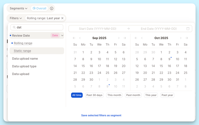
💡 Tip:
Use “Rolling range” if you want your dashboard or report to stay up to date automatically.
Comparing Date Ranges
You can use Date range and Comparison settings to visualize changes over time and compare key metrics between different periods.
Selecting a Date Range
Under Date range, choose how far back your data should go. You can pick from:
-
All time – includes your entire dataset.
-
Fixed timeframes such as Last 7 days, Last month, or Last year.
-
Dynamic ranges like Most recent week/month/quarter/year with data, which automatically adjust based on when new data comes in.
-
Custom date range – manually select start and end dates.
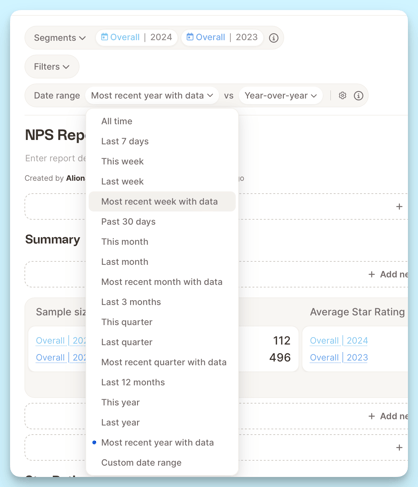
💡Tip:
Most recent year with data” is a great option for ongoing projects that update automatically as new feedback arrives.
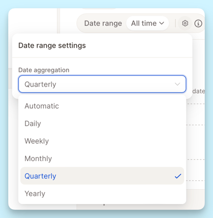
Choosing Intervals
The Date aggregation (or interval) setting defines how results are grouped over time.