This article explains each score type and how to interpret them in your reports.
Where to Find Scores
All score-related insights are located under Score / Rating in the report editor.You’ll find the following elements: Each can be added to your report and customized to display your chosen numerical column.
Key Metrics Overview
The Key Metrics Overview provides a quick snapshot of your project’s main metrics. You can use it to get an instant understanding of overall trends without diving into detailed charts.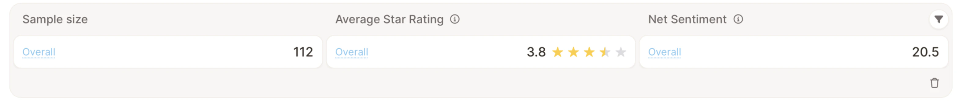
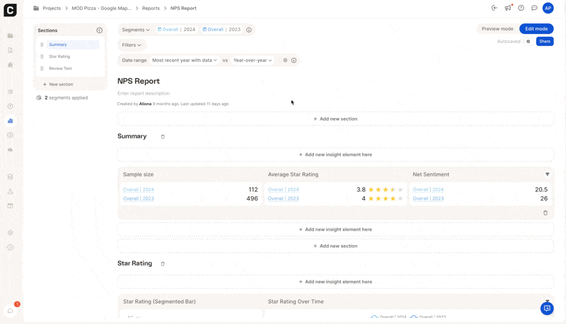
- Sample size – total number of responses included (e.g., 112)
- Average Star Rating – average of all star ratings in your dataset (e.g., 3.8 ⭐)
- Net Sentiment – percentage balance of positive versus negative feedback (e.g., +20.5)
You can also choose a Text to analyze column,this determines which responses the metrics are based on.
NPS Score
The Net Promoter Score (NPS) helps you measure customer loyalty by grouping respondents into:- Promoters (9–10)
- Passives (7–8)
- Detractors (0–6)
- NPS Score Gauge – your overall score
- NPS Over Time – trends across months or quarters
NPS = % Promoters − % Detractors
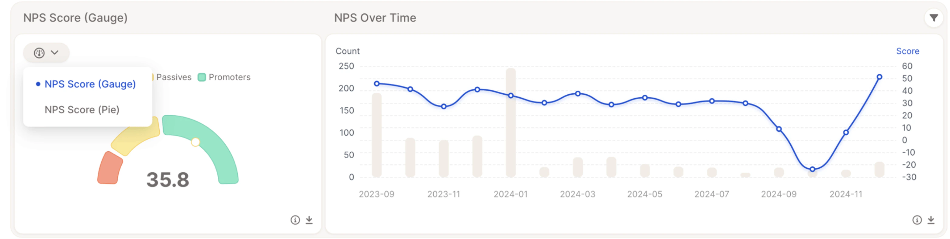
Generic Score
The Generic Score element lets you visualize any numeric rating in your dataset, for example, satisfaction, quality, or agreement levels, even if your question isn’t a classic NPS one.
How to customize it
Click the ⚙️ icon in the top-right corner of the element to tailor how your score is calculated and displayed.
- Score metric – choose how you want Caplena to calculate the score:
- Average → shows the average of all numeric values
- NPS → calculates Net Promoter Score from 0–10 ratings
- Top 1 / Top 2 Buckets → percentage of responses in the top rating groups
- Bottom 1 / Bottom 2 Buckets → percentage of responses in the lowest rating groups
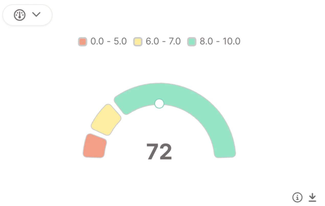
- Number of buckets – define how many segments you want on the gauge (for example, 3 for red, yellow, green).
- Bucket ranges – adjust the numeric ranges for each segment manually, or click Distribute linearly to let Caplena space them evenly.
- Displayed timeframe – choose whether the gauge value reflects the most recent period (default) or the entire period in the report’s date range. The companion trend chart always shows every period. See Insight Elements – General Overview & Settings for details.
Understanding “Buckets”
Buckets divide your rating scale into colored segments, such as:- 0–5 → red
- 6–7 → yellow
- 8–10 → green
When you select metrics like Top 1 Bucket, Caplena shows the share of responses in the highest range (e.g., 72% rated 8–10).
Star Rating
The Star Rating element visualizes ratings on a 1–5 scale, often used for:- App reviews
- Product ratings
- Service feedback
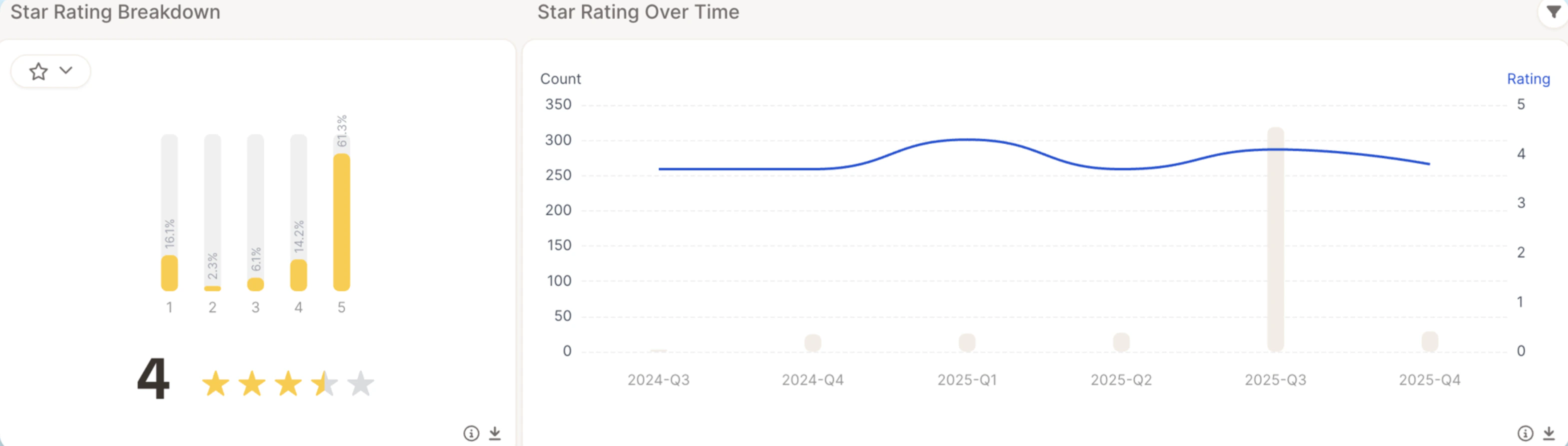
- Star Rating Breakdown — shows how ratings are distributed (e.g., how many 1⭐, 2⭐, 3⭐, etc.)
- Star Rating Over Time — tracks how the average star rating changes across months or quarters
Multi Score
The Multi Score element allows you to display up to three score gauges side-by-side , helping stakeholders instantly understand performance across key experience metrics. Instead of switching between dashboards, you can compare KPIs in a single, executive-ready view.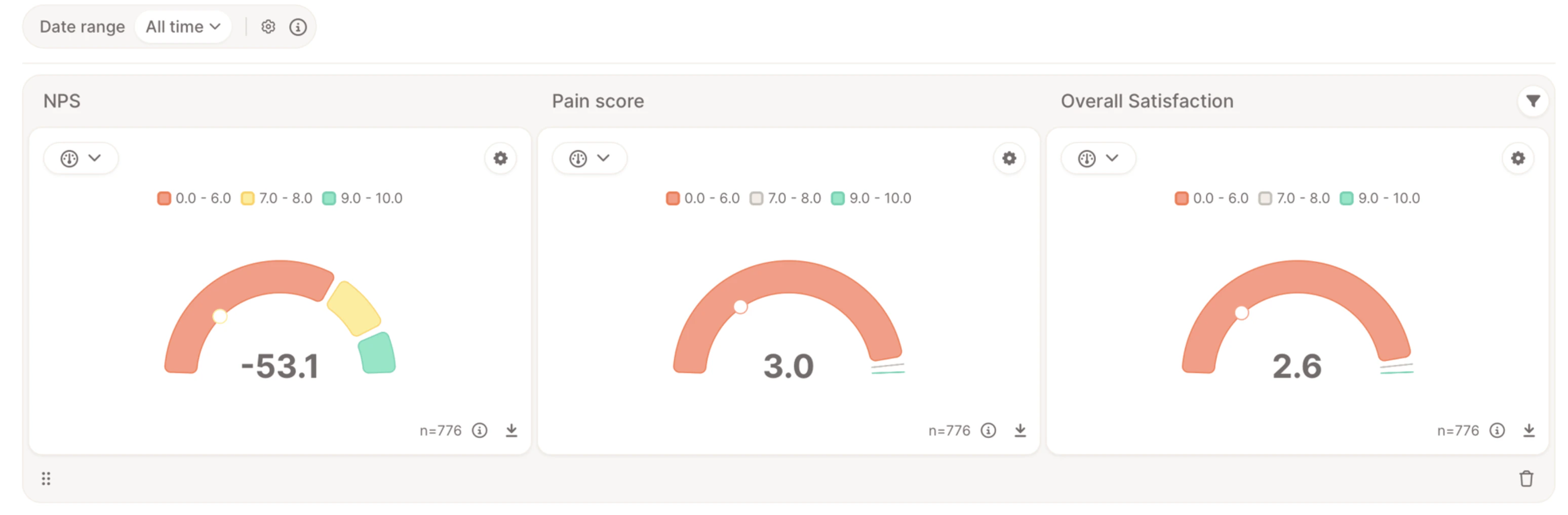
Best Practice
- Combine loyalty + satisfaction + pain for a full CX view
- Use bucket metrics when monitoring risk
- Use averages for operational tracking