

Summary
At the top, you’ll find your headline numbers: total responses and overall score. It’s a quick gut-check before you dig into the detail below.
NPS Score & NPS Over Time
The score shows up as a gauge, but the chart next to it is the one that matters more: NPS Over Time. A single number can hide a lot — in one real example, the score dips through the first half of the year before recovering, something the gauge alone would never show you.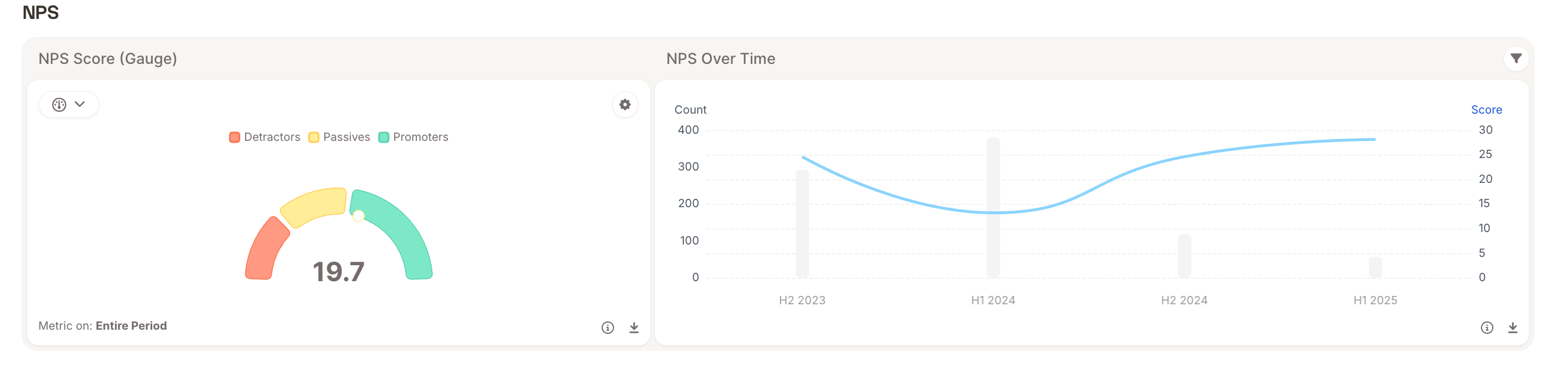
Topics Overview
This treemap breaks every open-text comment into categories, sized by how often each one comes up, so the biggest blocks are simply your biggest conversation topics. Next to it, an AI-written summary saves you the reading: in this example, it notes that people appreciate the coverage and pricing plans, but keep raising fees and patchy service.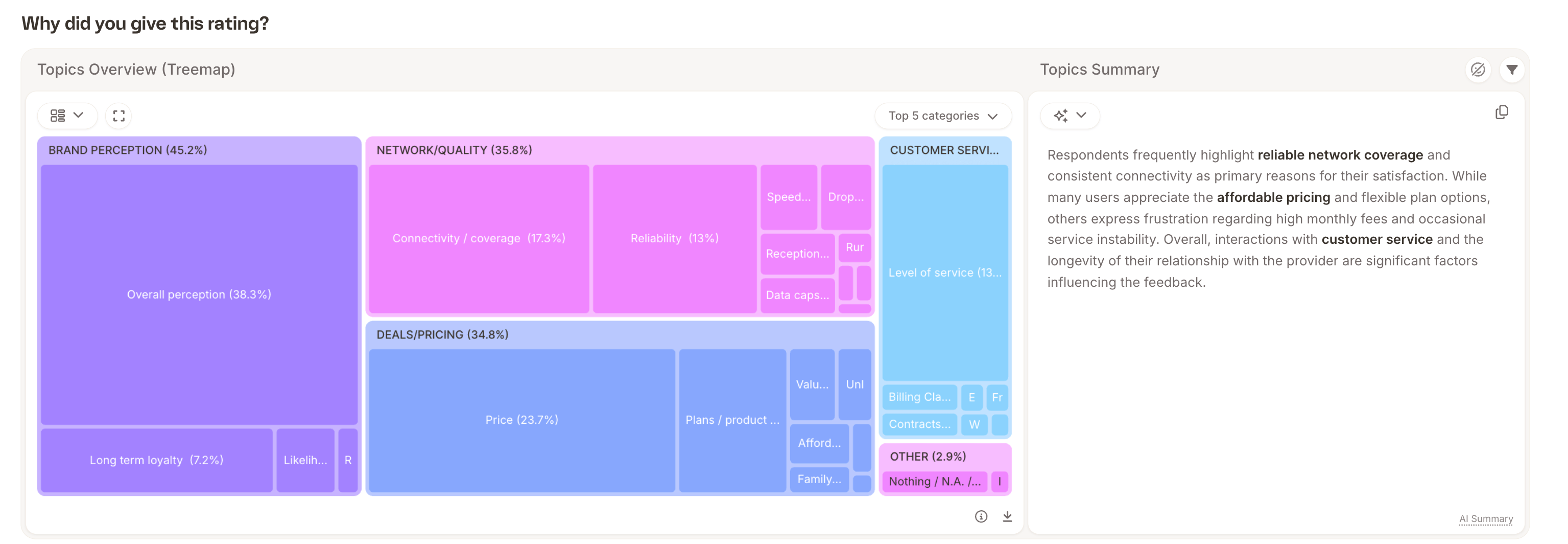
Topic Sentiment
Same categories, but shown as a green-versus-red split, so you can see at a glance which topics people are mostly positive about and which ones are genuinely divisive. Customer service, for instance, often splits far more evenly than brand perception does, a signal that it’s a more polarizing topic, not just a negative one.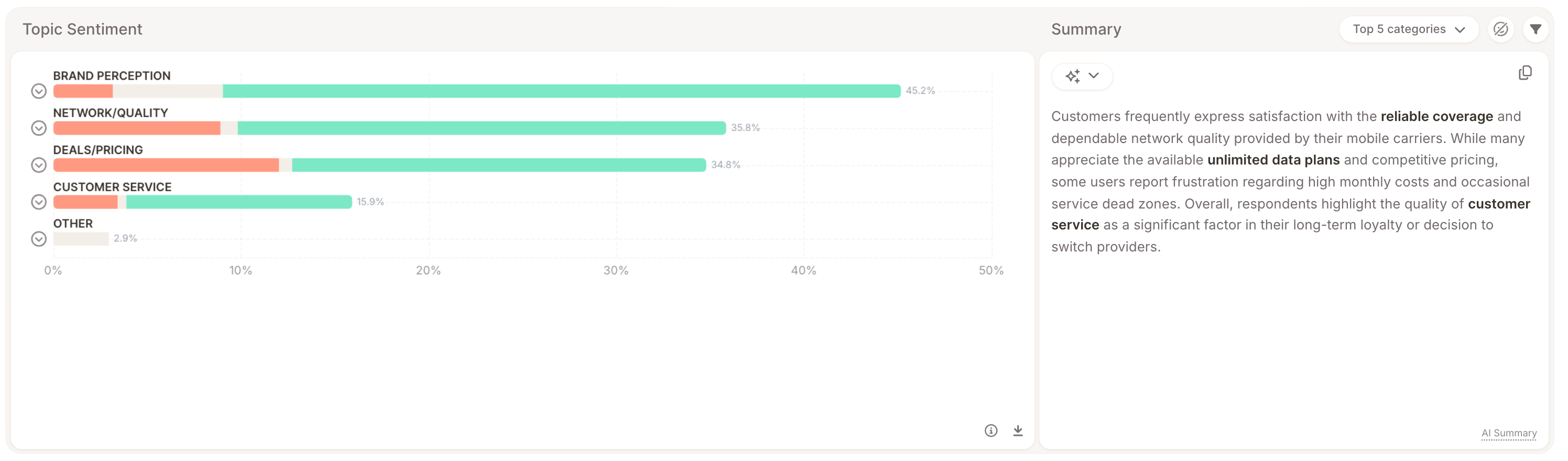
Driver Analysis
This is the most important section, because it’s the one that connects what people are saying to what it’s actually doing to your score.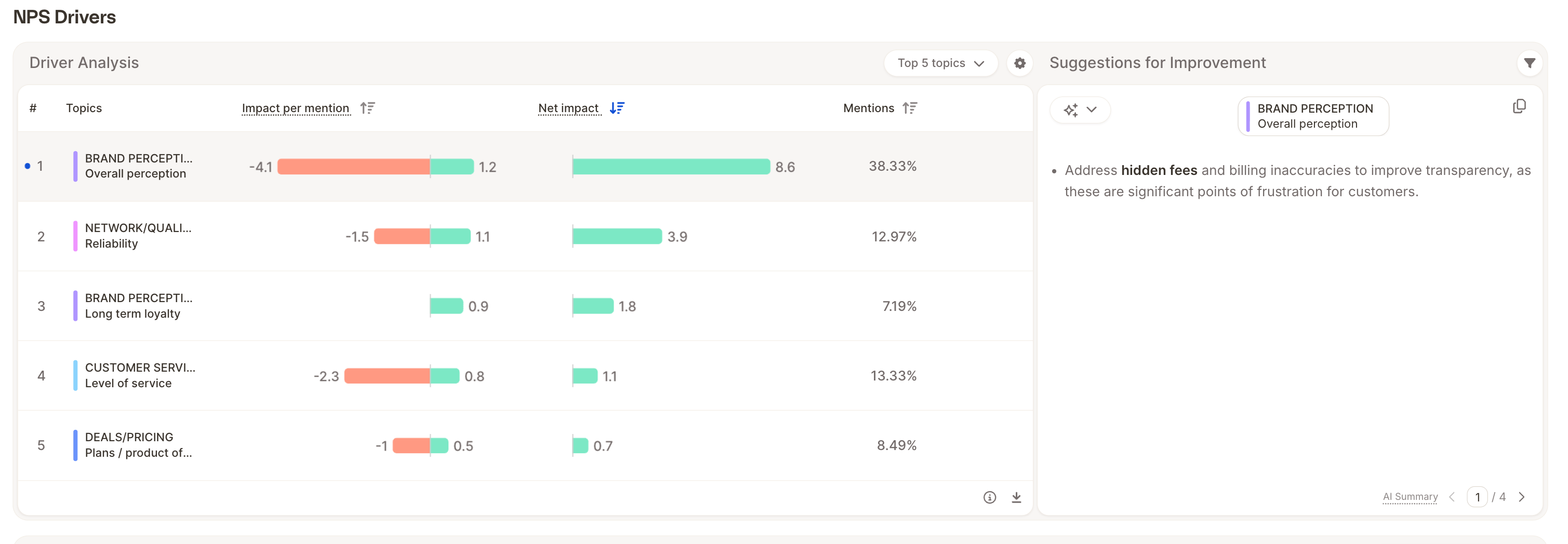
Views, in the left sidebar, is just the saved layout for the report. A View is really a tailored version of the report: it can come pre-filtered, with its own segments already set, so you’re only looking at the slice of data someone else configured for you. Take this telecom NPS report, for example: it has two Views. Default View shows the overall numbers and leaves Segments open for you to set yourself — pick whichever subgroup you want to explore. By Mobile Carrier, on the other hand, comes pre-configured with T-Mobile, Verizon, and Sprint already selected as segments — so the moment you switch to it, every chart is already split out by carrier (NPS Segmented, NPS Over Time per carrier, Topics Overview per carrier), without you having to set anything up yourself. Segments, in the top bar, lets you slice the whole report by a subgroup — for example, “which mobile carrier are you using,” with AT&T, T-Mobile, and Verizon as options..