

Where to find it
When adding an insight element to any report section, look for Custom at the top of the Generate category in the side panel. You’ll see a blank canvas with a prompt field: “Describe what you want to visualize and AI will build it for you — the sky is the limit.”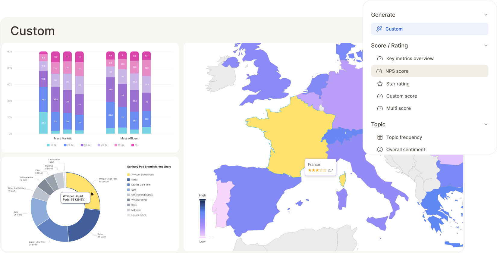
Why use Custom instead of a preset
The preset elements (NPS score, topic frequency, driver analysis, and so on) cover the most common report needs. Reach for Custom when you want:- A specific chart type not covered by a preset — a bar chart or a map are just two examples; you can also ask for a pie or donut chart, a butterfly chart, a world or regional map to show results per region, a stacked bar chart, and more
- Precise styling — a particular color palette, a shared scale across charts, labels in a specific place. Note that a lot of this is also achievable through a custom theme applied to a whole report, so Custom isn’t your only option if you want consistent styling everywhere
- Multiple charts in one widget — one per segment, side by side, without building each manually. A single Custom insight element can contain several charts, so you stay within the same insight-element-with-widgets framework rather than needing separate elements
- A one-off visualization for a specific stakeholder ask that doesn’t need to become a permanent report fixture
Writing a good prompt
The more specific your prompt, the closer the first result lands to what you had in mind. A strong prompt usually mentions:- Chart type — donut, bar, stacked bar, map, line, radar, etc.
- What’s being measured — which columns, scores, or topics (you can reference several at once).
- How it should be split — by segment, country, verification status, time period. Keep in mind that any filters or segments already applied to the report also apply here — Custom builds on top of that filtered view, not the full unfiltered dataset.
- Styling cues — color scheme, exact labels, title, legend placement, rounding.
See the example gallery
A dedicated report showing every example below live, with the exact prompt used for each — a fast way to browse what’s possible before writing your own.
Example 1: Grouped bar chart
Prompt: “Grouped bar chart comparing average Overall Rating for the top airlines by review volume, with bars split by Verified (true/false), sorted by overall average descending. Show the exact value above each bar.”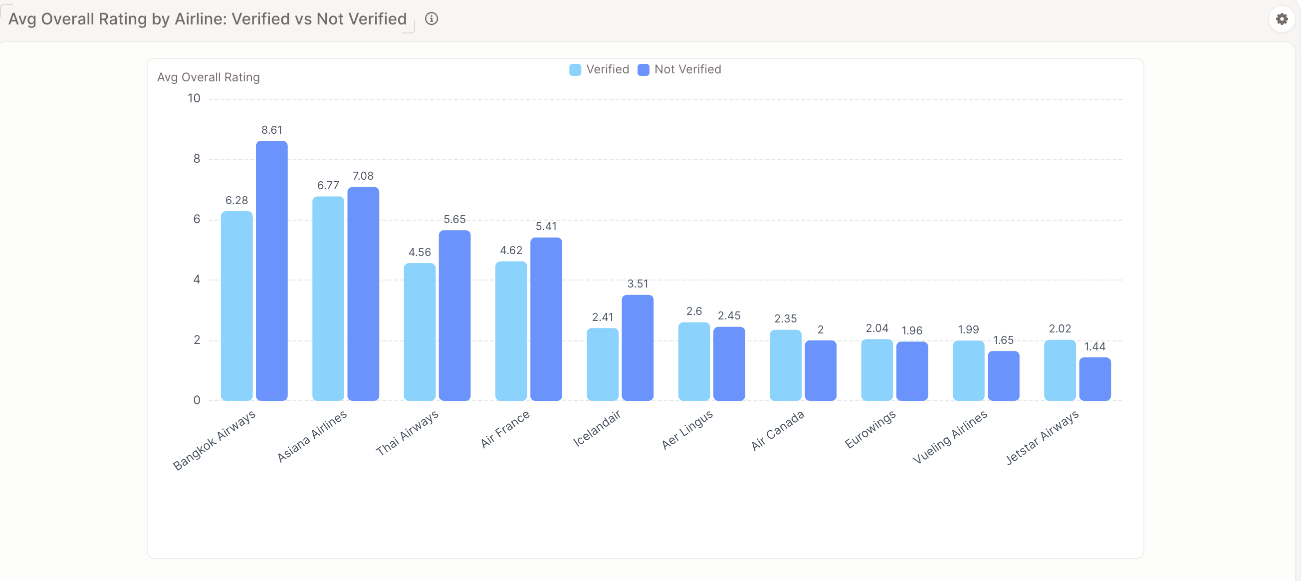
Example 2: World map
Prompt: “World map showing average Overall Rating by Territory, colored on a red-to-green scale.”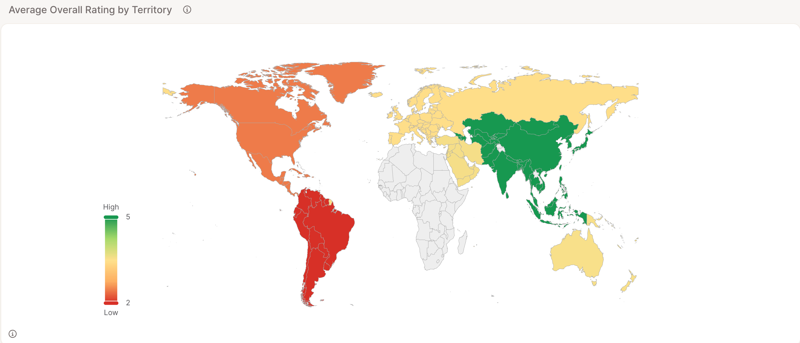
Example 3: Donut charts, before and after
First prompt: “Two side-by-side donut charts comparing the share of Recommended = Yes for Verified vs Not Verified reviews.” The first result had two real problems: the percentage labels were cut off mid-number (“yes: 29…” instead of the full value), and both slices used shades of blue, making “yes” and “no” hard to tell apart at a glance. Refined prompt: “Two side-by-side donut charts titled ‘Recommendation Rate: Verified vs Not Verified’. Left chart: Verified reviews, right chart: Not Verified reviews. Each shows the share of Recommended = Yes (green) vs No (red). Show full percentage labels with one decimal place, not truncated. Add a legend below each chart.”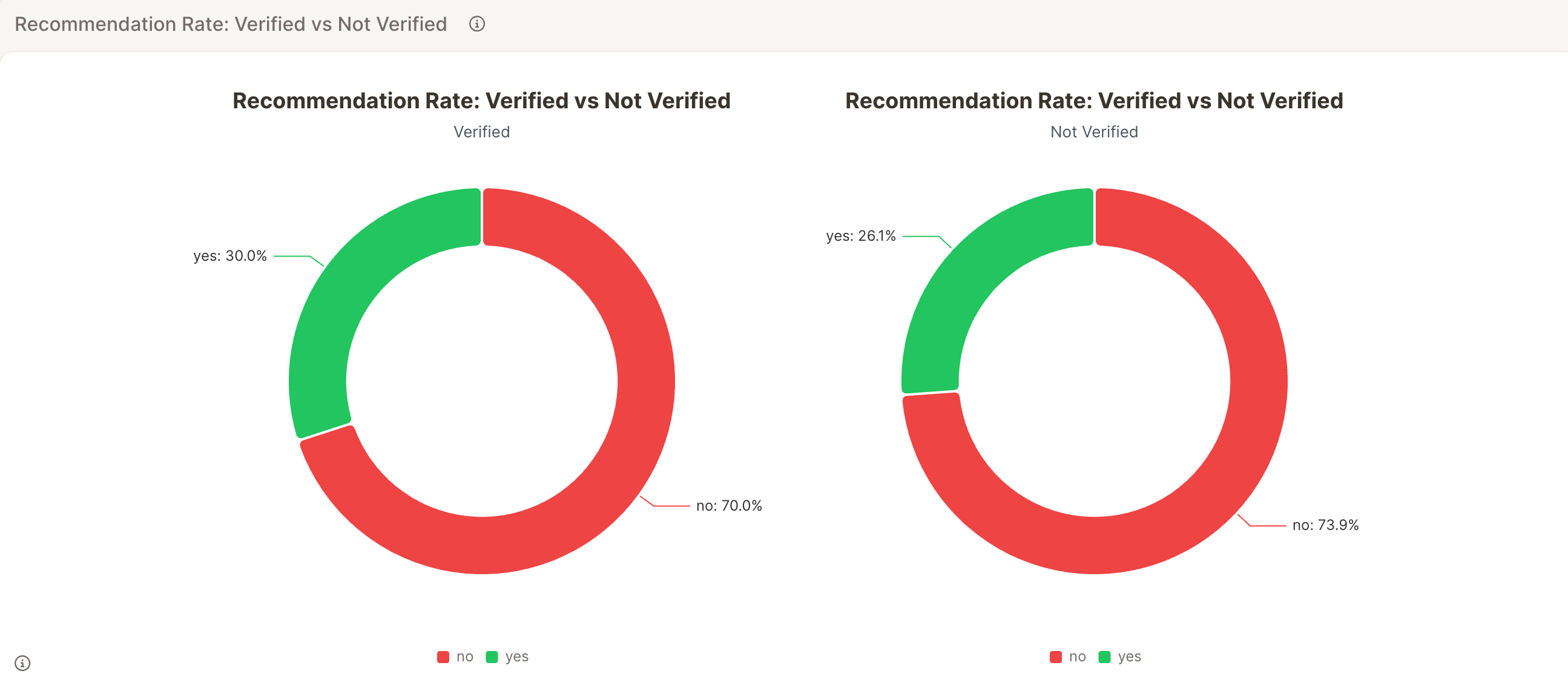
If a result looks almost right but has a specific flaw: truncated labels, confusing colors, a missing title, name that flaw directly in your next prompt (e.g. “not truncated”, “use green/red instead of two blues”). It’s usually faster than starting over with a new description.
Example 4: Radar chart
Prompt: “Radar chart comparing Seat Comfort, Cabin Staff Service, Food & Beverages, Ground Service, Value For Money, Inflight Entertainment, and Wifi & Connectivity for Air Canada vs Air France. Round all values to 2 decimal places in both the chart and tooltips.”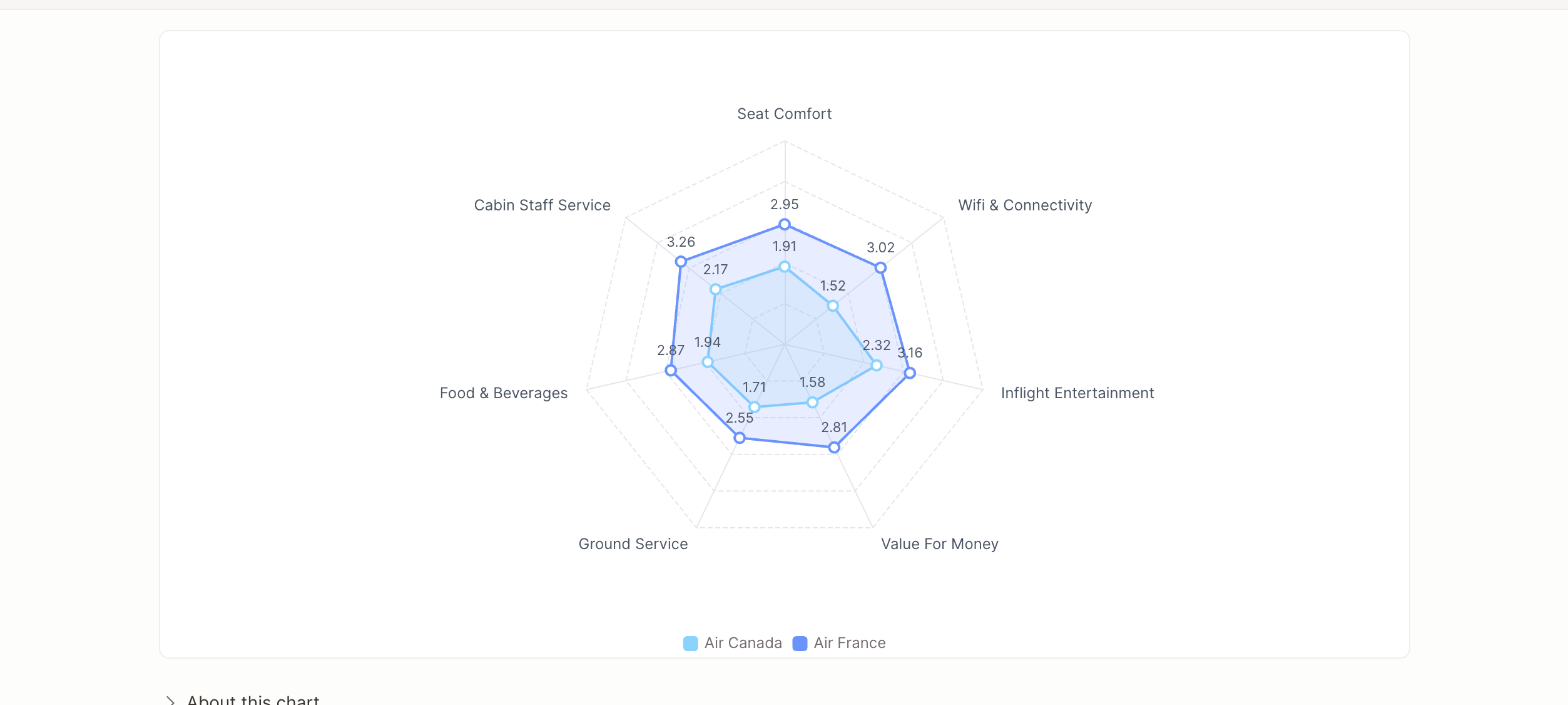
Example 5: From addresses to a city-level map
Location often matters as much as the metric itself. Store visits, service points, lounges, delivery hubs, whenever your data ties back to a real place, seeing it on a map tells you things a table can’t: whether a problem is spread evenly or concentrated in one region, or whether performance actually tracks geography at all. The catch: Custom can’t show a city-level map on its own, and it needs coordinates, not addresses, to plot anything. Two small problems, one fix, let’s walk through it.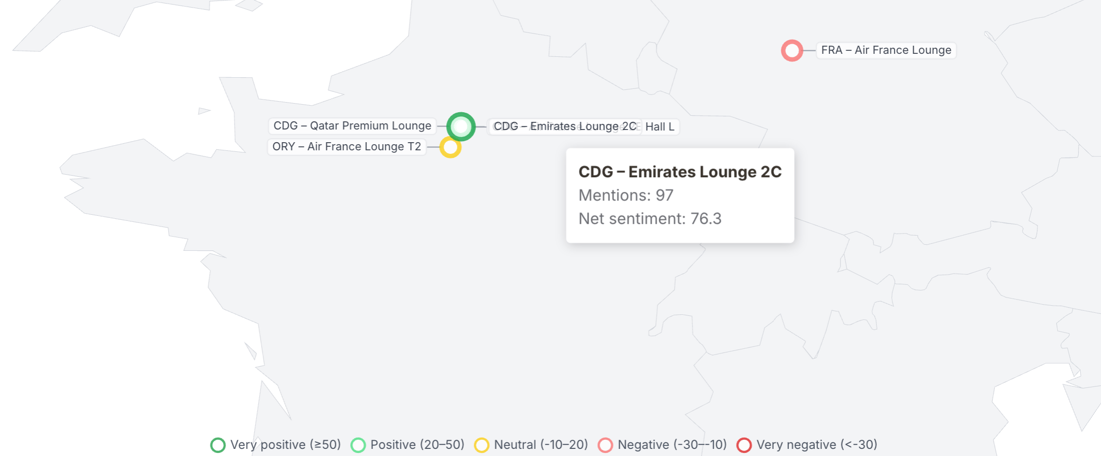
Turn addresses into coordinates. Before writing any prompt, add a Smart Column that geocodes your address column:
- Go to Smart columns → New column → Formula, and set Output column type to Text.
- Use the built-in
address_to_coordinatesfilter — either write it directly:or click Generate with AI and describe it in plain language, e.g. “Convert the address in the Source column into coordinates.” - Compute preview to confirm you’re getting a
[longitude, latitude]array. Save and apply to all rows.
{@[2]}) instead of real values. A direct follow-up — “tooltips show placeholder text instead of the actual net sentiment and mention values, please fix” — resolved it. Worth a quick hover-check before treating any Custom map as final.
Refining an existing Custom element
You don’t need to delete and start over if a Custom element isn’t quite right. Below the chart, use the “Refine your chart…” input field to describe what to change, the same “name the specific flaw” approach from the examples above works well here too (e.g. “round all values to 2 decimal places”, “use green for yes and red for no”).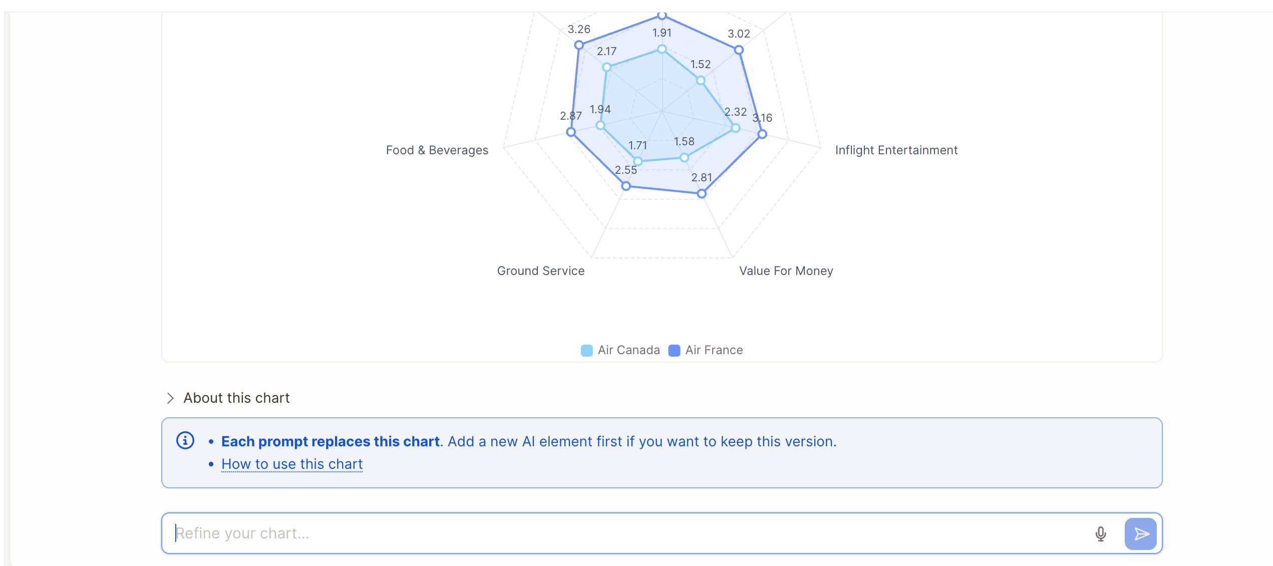
Each refinement replaces the current version of the chart — there’s no automatic version history. If you want to keep an earlier version before refining further, add a new Custom insight element first and refine that copy instead.
Tips for better results
- Name the exact columns or segments if your project has several similarly-named ones — the AI works from your project’s structure, and precision here avoids guesswork.
- Ask for value labels up front (“show the exact value above each bar”, “full percentage labels, not truncated”) — this was the single biggest fix across our test prompts.
- Say if you want one chart or several — “one chart per segment” is a very different ask from “one combined chart with all segments shown together.”
- Specify colors when meaning matters — e.g. green for “yes” and red for “no” reads instantly; two shades of the same color doesn’t.
- Mention the scale explicitly if comparability matters — e.g. “on a shared scale” ensures multiple charts use the same color range instead of each auto-scaling to its own data.
- Ask for rounding if precision isn’t the point — raw unrounded decimals in tooltips or labels look unpolished; say “round to 2 decimal places” up front.
- Iterate by naming the specific flaw rather than rewriting the whole prompt — small, targeted edits get you there fast.
- Use Custom for exploration, then swap to a preset element later if the chart turns out to be something you’ll want to keep updating long-term with built-in configuration options.
Related
- For the full list of ready-made elements, see Insight Elements – General Overview & Settings.
- Example gallery report showing every example live.